Tuesday, 31 January 2017

Production Schedule

Here is our production schedule:


The majority of our scenes are filmed in the same location, the garage, meaning it is more likely that we will be able to film them all in the same day. This will also help when we are editing because we will not have lighting inconsistency or problems with the make-up or the costumes looking different. We will film in the evening as it begins to get darker outside to fit with the convention that thriller films usually have, low-key, dark lighting. 
For the first 4 scenes we will include all of our actors- 2 of which are people who aren't in our media group- so we had to check when these people are available for filming as well. As well as this, we need to make sure they are available for the day after just in case something goes wrong and we don't get it all done at once. The 5th scene we will only ned the male actor for as you only see his hands as he types something onto the computer- you won't even see his face so if we don't manage to get this filmed its not that big of a deal as we can do it ourselves.
The final scene is computerised as it is just the title so we will have to do that on the school computers during the editing process, hence why the date is different as we will be unable to do that in our own time. 

Monday, 30 January 2017

Location Research

This is the location we have chosen to film in:


We will use the garage of this house as our location because it is accessible for our group, (its at one of our houses), its is easily manipulated. This means we can move things around and add or take away the lighting when we see fit. It means we will be fully in control of the location. As well as this, we will be able to film without any interruptions or distractions This location will be effective for the film as many thriller movies that involve a hostage situation are in places such as this with: ironically, it almost shows the normality of the situation. It shows the audience that our main character hasn't planned this or had it in her mind for a while, that its impulsive as she's used the only location that is available to her- her garage. 

Here are the pictures of the location we have chosen- 
The pictures show the front of the house, with the garage and what it looks like inside. We are going to remove all of the junk that is in it, too make it look realistic and although it is smaller than we anticipated we'll make it work. It has the perfect lighting which isn't too much, but enough to set the ambience of the scene that we are shooting.  


Wednesday, 25 January 2017

Our Storyboard

This is our storyboard:
In this image we show the first 8 shots of our thriller opening. It narrates the start of the scene. It starts as a black out and fades into a shot of the bat, the weapon of choice, we have chosen to use this shot because it outlines to the audience the weapon that the woman has chosen as well as building tension because in that moment you wouldn't know what was going on- who was using the bat or what for. During the decision making process we decided to add in the shot of the woman sitting on the sofa, she is going to be muttering to herself, almost as reassurance that what she is doing it right. We chose this because we wanted to indicate early on that she has a mental illness, and she sees this as justification for her crimes. Another shot we added in was the shot of the mistress' eyes, we did this ultimately to show her fear and indicate that she is being held against her will for something she is unaware that she has done wrong. 

This image shows the next 8 shots within our scene. It shows the women, moving around and it from her perspective almost as though we want the audience to understand what is going on and why she is doing what she is doing. These ones are ultimately a lot longer than the ones in the previous image because it includes the bulk of our thriller. 2 of our shots equate to 10 seconds each. The first being the second shot on the image. It will show a high angle shot of the women walking slowly towards the front of the screen, to stand in front of her victims. There is also a shot of the women knocking the light with her bat, we decided to add this to show her dominance in the situation. As well as this it will add tension to the scene. We have also decided to have an close up of the  husband and wife together, we are going to use this shot to firstly show them together, indicating that they are married. It also hows her anger towards him as she will get up in his face and call him a 'cheating bastard'.

These were the final 8 shots of our thriller opening. These are our shots that build the tension within our thriller. The soundtrack that we will use within these scenes will mirror this. We have decided to do the fourth shot from the perspective of the mistress and the black screen straight after will be as though she has closed her eyes. The sound will stop here and we'll wait a few seconds before inserting a scream. The next shot will be as though someone has opened their eyes. The setting would've changed to an office setting where we see his computer screen. This would be the beginning of the rest of the film and after that we will put the title page of our film, 'Them'. 

Friday, 20 January 2017

Font Research

We chose the title 'Them' for our thriller as we have decided to do it from the unfortunate perspective of the wife. She is so mad that her husband, who she loves very much, could do something that could hurt her so deeply. She then begins to blame him and his mistress for the impact it has had on her mental illness. She blames 'them' for all her problems in life.

Here are the four fonts I have chosen:


Here is the first one, I liked this one because if we chose to write it in red it could look like blood. This would link to the theme of violence in our thriller opening and as well as that the brutality of the violence would also be portrayed through this. I like that its written in black capitals as it will stand out against anything we put behind it.


The second font I have chosen is one that looks as though it has roots growing out the bottom of it. This could link to how you make a family tree. The women who married this man placed her roots in him, their whole future and she feels like that has been ripped out from under her. The gaps in the words can link to the mental health, how parts of her personality are missing which mean she reacts more than she should to this situation. I think this font would be written in a dark green or brown colour which links to the idea of a family tree.

This font, is very similar to the first font so it links together the first font as well as the idea about the gaps in it linking to her mental illness. However the differences include the fact that this one is bolder and the corners are harsher- which inclines me to believe this one would fit better than the first one as it looks like it would fit a thriller movie better. I believe this would also be written in a red colour. This would again represent the theme of violence we would like to portray.

This one is different to the others, although it still has the theme of dripping blood, it isn't block capitals. I think this gives it a feminine touch- indicating that the antagonist is a female. As well as this, it could be seen to not be as 'creepy' as the others, which may fit our film opening better as it isn't a 'creepy' film opening. This means our film isn't based round supernatural occurrences or something similar it is very much a real life story (although it may not occur in everyday life). The font here enables you to think this.


Thursday, 19 January 2017

Title Research

I have chosen four well known thriller films and have analysed them here:


Basic Instinct is a 1992 erotic thriller based around the murder of retired rock star Johnny Boz. The colour red of the word 'Basic' links to the theme of death in the movie. It is written in a basic font, possibly to draw attention to the next word- which is 'Instinct'. It is written in a more disturbing font, that is pushed closer together and is very sharp, it doesn't have curved edges. This could link to the brutality of the films main focus and how his life was taken from him without a second thought. The length of the letter 'I' links to the fact that the was stabbed to death with an ice pick. The word 'instinct' can be defined as 'a quality, especially a desirable one' which links to the idea that it is in this persons instincts to kill.


Shutter Island is a 2010 psychological thriller in which 2 US Marshals have to go to 'Shutter Island' which is remote and barren in order to investigate the mysterious disappearance of a murderess from the hospital for the criminally insane. The colour red links to the murderess and her compulsion to kill. It shows that she's dangerous and they want everyone to know it. It is written in block capitals- almost as if the name itself  is a warning- telling people not to go there because it could result in their death. The fact that some of the letters are beginning to fade firstly show the eerie island for what it is and also link to the murderess and her disappearance. The name 'Shutter Island' tells us immediately that it isn't somewhere you want to be. If you 'shut' something you are usually avoiding it- just like how the US ignore the hospital for the criminally insane on this island.


The Dark Knight is a 2008 superhero crime thriller film. It is clearly apart of the bat man series, you can see the intentionally placed logo behind the word 'dark'. Personally, I think this was used for advertising purposes, with the logo in the back you didn't have specifically say it was apart of the Batman series as people will just assume it is. The title is in a white font- this means that it stands out against the background which seems to have a lot going on. There is a use of an oxymoron- the word 'dark' is written in a white colour suggesting that not all is as it seems within the movie as it is a very pure and innocent colour. They have used a play on words- the word 'Knight' suggests it is about a person and that it is set at night which you can clearly tell from the scene playing out behind it.


Psycho is a 1960 psychological horror thriller that focuses a women who goes to stay at a hotel run by Norman Bates and his mother. he use of the colour yellow in the font is a contradiction to the movie. The colour yellow represents optimism and stability along with self-respect and self-control. However clearly Norman Bates lacks of all of these qualities. This gives the audience a false sense of security about the stability of the main character. The crack in the letter 'C' could foreshadow the use of the kitchen knife that he uses to kill the women in the shower. The crack through the middle of the words that means some of the letters are titled, could show the instability of Norman Bates. Again the use of block capitals could be a warning.


Monday, 16 January 2017

Target Audience Research

 Here are the results from our questionnaire that we devised (see below)


Here is the questionnaire:

From our results, you can see that our target audience is definitely teenagers which may be down to the fact that as teenagers ourselves we can identify what they would enjoy seeing more based on what we would enjoy seeing in the thriller opening. The majority of the people we asked said their favourite type of thriller film was a psychological thriller, this was 30% of our recipients, around 25% of them said horror thrillers. This fits nicely with our idea as we want to make it seem as though our lead character has a mental disorder and a lot of it will be based on what's going on her head. As well as this, we hope to include some of the conventions of a horror-thriller film like a lot of gore and weapons. The most frequent answer to 'What is your favourite thriller film?' was Taken, which involves a hostage situation, which is what our thriller opening is based around. This shows that our target audience have a direct link to what we want for our thriller.
75% of our target audience liked or loved the idea of a male victim instead of a female one, and 80% thought the idea of cheating was wrong- one even went as far as saying 'death row' directly linking with the feelings and emotions of our female character. But overall the all these ideas help to link the feelings of our audience with those in relation to each of our characters. However, I think that we need to create more sympathy for the male and his mistress as although they did do something wrong, they shouldn't die because of it.
80% of our target audience like the idea of the hostage situation, helping to gain an interest in our film opening, this is good as this means they hopefully wouldn't get bored. The other 20% said things like 'its overused' which is true, many of the thriller movies I've seen include hostage situations- but hopefully, if we do it in the right way it'll be unique and grab the audience's attention.
80% of our target audience like the idea of suspense being built in the beginning of a film- which correlates to our idea of leaving people on the edge of their seats wanting more. Hopefully, after productions, the people in our target audience enjoy what we have created and feel as though the feedback they have given to us has influenced our artistic choices throughout.

Film Institutions: Conglomerate

Paramount Pictures:

Paramount Pictures is a large conglomerate that has been around for 104 years, it was founded in Los Angeles by W.W. Hodkinson, Aldolph Zukor and Jesse L. Lasky. It is now classed as one of Americas 'Big Six' Film Studios along with Walt Disney Studios, Warner Bros Entertainment, Fox Entertainment Group, Universal Entertainment Group and Sony Pictures Entertainment. They have helped to produce some of the worlds biggest thriller films such as: Instinct, Ghost, World War Z, Mission Impossible. These are all extremely large grossing films that have done really well in the box office and a long time after.

Ghost Opening sequence:
The opening sequence is very minimal, it involves the camera moving around a room showing you objects whilst some of the film credits pop up on the screen. Although the opening is cleverly thought out for the film, as a stand alone thriller opening I don't think it works. It has blurred images and natural lighting, making the audience wonder what it is or what the room is used for. The music is orchestral based with various piano based crescendo's which does attract the audiences attention to the screen. Although I hope to capture some of the essence this opening has, I don't think it gives enough of the story away in order attract the audiences full attention.


Would we consider working with them?

They have a large following of people who enjoy their movies who would watch ours just because they made it, allowing the amount of people who see the film to increase and possibly the amount of people who enjoy the film will increase due to this. They have 10 different production deals with smaller companies so that means they have many ways of making our movie and a lot of people who would invest a lot of time and effort into making it at the best of their abililty. As well as this, Paramount Pictures are international, this increases our pool of target audience as well as increasing the advertising and media coverage our movie would get. Finally due to it being a conglomerate they would have a higher budget as they would be able to do everything themselves without needing to outsource to smaller companies. However this being said we are more likely to loose creative control over our movie. In addition, even though they have a lot of experience, Twisted Pictures has a lot of experience with just thriller films so I think we would lose the help and input they could offer us as it would be so personal to us and them. 

Film Institutions: British Company


British Film Institute: Scott Free Productions 

Scott Free Productions was founded in 1970 by brothers Tony and Ridley Scott. It was originally called Scott Free Enterprise but in 1980 they changed their name to Percy Main Productions, the place in the North East England where the father grew up. This was before in 1995 changing it a final time to what we now know is Scott Free Productions. They operate under RSA, which is Ridley Scott's other, more successful company. With offices both in London (where it originated) and Los Angeles is able to make both British and American films. It is known for various thriller films including; Enemy of the State (Will Smith), Hannibal (Anthony Hopkins and Julianne Moore) Body of Lies (Leonardo Dicaprio and Russell Crowe) and The Martian (Matt Damon). The company are also responsible for TV shows such as The Good Wife- which is a big hit in both the US and the UK as well as the 2017 BBC TV series Taboo starring Tom Hardy. 
 

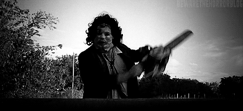
Hannibal opening sequence:

The opening sequence starts with a blank screen and a voice over of 2 men talking to each other. This immediately sets up the suspense as it makes the audience question what is going on and who they are- this is similar to what we would like to have in our opening. The first shot we see is a long shot, which establishes the room they are in and all 3 of the main characters in the scene, it then cuts to a close up of a main who appears to have a mental illness of some sort that causes a physical deformity. This goes with the stereotype that disabled people are seen as 'a problem with society' as he appears to be the antagonist in the scene. The men are talking about Hannibal Lector- making the audience wonder about who he is. There is minimalistic music used in this scene, it is an instrumental and although it doesn't take away from the scene it does add an eerie tone to it. This is something that we would also like to incorporate into our scene- I think the music is a big part of the scene, but it shouldn't draw attention away from what is really happening Finally the scene ends with the title of the film, 'Hannibal' is written in a creepy font and in the colour red, this could link to the idea of the film as well as to draw the attention of the audience to the screen. It leaves you with a sense of longing, you wonder what's going on and who these people are, allowing you to invest some time into actually watching the film. Hopefully our film opening will incorporate some of these ideas to help it be the best it can be.

Would we consider working with them?

This company is experienced as they have been around for almost 50 years helping to produce some of the worlds biggest films. As well as this, with links in both the UK and the US, it widens the amount of people in our target audience age range to people both sides of the Atlantic. This could also mean they have a bigger budget, so they will have a better quality of filming equipment and a good production team. However, unlike Twisted Pictures they don't just specialise in thriller films so they wouldn't be able in give you the artistic insight that maybe Twisted Pictures could. As well as this, because it is a bigger company its more like they we could lose creative control, this could mean that our vision for the film would be lost.

Wednesday, 11 January 2017

Film Insitutions: Independent Company

Independent Film Institute: Twisted Pictures

Twisted Pictures was founded in 2004 as a result of the disbandment of Evolution Entertainment by Mark Burg, Oren Koules and Gregg Hoffman. There most famous work is on the Saw film series and the remake of Texas Chainsaw Massacre but other credits include; Chain Letter, The Tourtured and Dead Silence. As well as this, in 2012 they started their own company specifically aimed at Television series called 'Twisted Television' 

Saw Film Series:
They were partners with Lionsgate and they signed a nine-picture deal with them. So far they have made seven of these films. The Saw film series are well-known around the world, which means they are gaining more and more popularity since the release of the first movie in 2004. They also made the video games Saw and Saw II: Flesh and Blood as apart of the film series.

Texas Chainsaw Massacre:
In 2009 they made a deal with the rights-holders for Texas Chainsaw Massacre, Bob Kuhn and Kim Henkel to make and produce the remake of the original 1974 version. This was after their deal with Platinum Dunes fell through. This gave them the rights the multiple film series. 

The Tortured:

It was produced by Twisted Pictures in partnership with Light Tower Entertainment. It stars Ericka Christensen and Jesse Metcalfe as parents of a little boy who was kidnapped and murdered by a man named Kozwolski, after only getting 25 years-life, the couple feel his sentence isn't justice for the crimes he had committed. This leads them to kidnap him and torture him in the way he had their son. 

The film starts in media res (the middle of the action) a man is standing on a bridge over the motorway on the phone to the police- he is saying that his son has been kidnapped. This immediately sets the scene for the rest of the film. The first thing that you hear is the dialing tone, closely followed by '911, what's your emergency?' This quickly adds tension to the scene from the get go; you want to know what happened to his son, how it happened, and whether or not they will see him again, drawing the audience in. The scene then cuts to a crane shot, of a house with police cars and men surrounding it, this suggests to the audience that the family of the boy who was kidnapped live here. Then there is a mid-shot of a women getting out of her car, the expression on her face, shows that of concern and worry indicating that she is unaware of what is going on with her son. This is then confirmed as the camera pans with her as she runs into her house. This is however is edited to it is in slow motion with the sound of her heart beat and slow breaths over the top- this is to show her worry and make the audience feel empathy for the women. Its so hard to imagine what she would be going through and the thought of a couple who lost their only child is heartbreaking for the audience. It really pulls on their heart strings and helps them to escape their world and become invested in the world that belongs to Elise and Craig. 

I love the way it opened, it was great at building the tension and my group want to start ours in media res. I think it was great for tension building and although its said that a kidnapping/ hostage situation is overused, if it is done in the right way it can be unique and that is something that this film does and I would hope to incorporate into our opening scene too. 


Would we consider working with them?

We would consider working with Twisted Pictures because its clear that their man focus is horror/ thriller films meaning that it is their area of expertise. They also have a lot of experience when it comes to it, so they may be able to offer insight into how to improve our film opening. When looking at their films, although they are low budget, the quality of them is quite high and there is also an expected level of gore, from the Saw and Texas Chainsaw Massacre films which will help with our movie. However they are an independent film company, this means to make a sucessful film they have to go into partnership with larger companies like Lionsgate and sometimes even conglomerates like Universal.